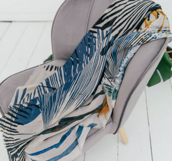
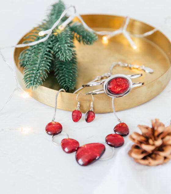
According to the Pantone Institute, it will be: “A vibrant color palette that reflects our hybrid lifestyle and is a celebration of bold and joyful moments.” And that is just perfect for Miss Milly, big grins all round.
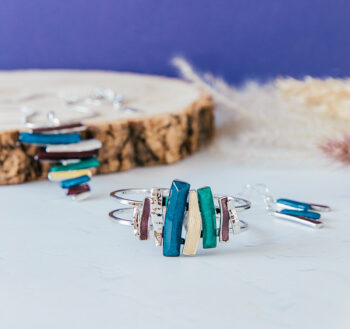
We don’t work quite as far ahead as the fashion houses but our collections for the coming season were finalised in the Spring. And in June, we’re now working on next Spring & Summer. So we pay attention to the colour forecasts. We have to ensure a palette that has a good balance of trend colours and those that always sell well for us. For example, we would never have a Spring & Summer season without turquoise, it’s unthinkable!
The Pantone Institute’s announcement goes on to say: “Colors for Autumn/Winter 2022/2023 contrast our competing desires for calm and comfort with energy boosting vitality through a range of restful and restorative colors, in tandem with exuberant tones.” This covers all bases really as their analysts are taking an overview of colour, rather than looking specifically at fashion and accessories, so whilst we always take note of their predictions, we also look at the catwalks and more fashion specific forecasts. And from there we pull together our own palette.
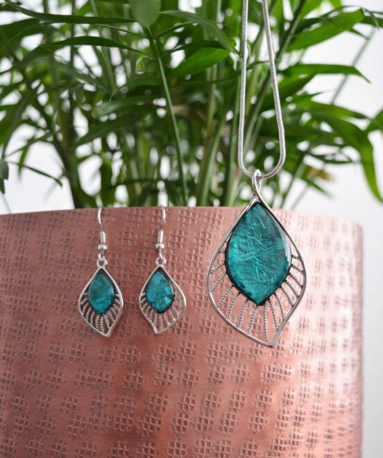
Green has been quite dominant in fashion so far this year and that trend is set to continue. We’ve only ever really worked with lime and teal but for next season, we’ve got some emerald tones too.
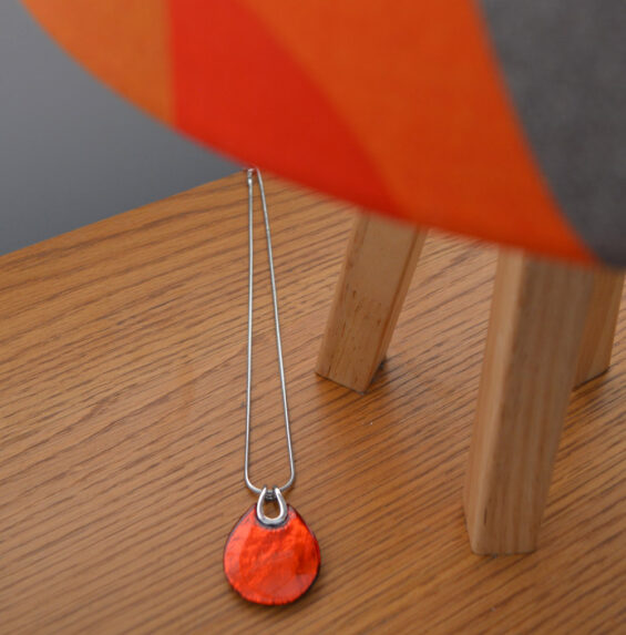
When you get the right shade, orange can be brilliant for the Autumn. We’ve had great success in the past with a deep, red toned orange that will feature again this year. It’s a bridge colour carrying the bright vibes of Summer through into Autumn and beyond into the reds of Christmas.
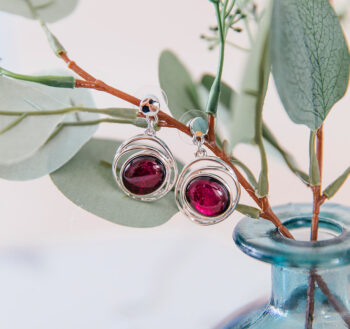
And yes, red will be back, we always have some for what the trade terms the ‘Golden Quarter’, the run up to Christmas. This year, we are using dark red, claret and burgandy, which, depending on the material they are used with, can sometimes look more purple. Scarlet is a colour that doesn’t work well in jewellery, it can look cheap, and red is probably the shade we have the most trouble getting right.
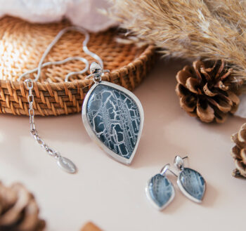
Our favourite colour combination for this Autumn & Winter, and you’ll see it in a few of the new pieces, is a dark purple red called Tawny Port with a light blue and pale mauve or cream. Used with silver-coloured metal, it’s a very classy and elegant mix, and we love it! We’re also introducing a gorgeous shade called Tapestry, which sometimes looks like a dark blue-grey, and sometimes it is more of a teal. It’s worked a treat with other blues in tonal combinations but also as a standalone colour. And it really changes in shade when used with resin depending on whether the backing is aluminium foil, mother of pearl paper or marbled paper.
Miss Milly is all about colour and using it to express yourself. Some people like to follow the trends and others like to wear what they know suits them. Whatever your preference is, we’re pretty sure you’ll find something to suit within the Miss Milly treasure trove!
